
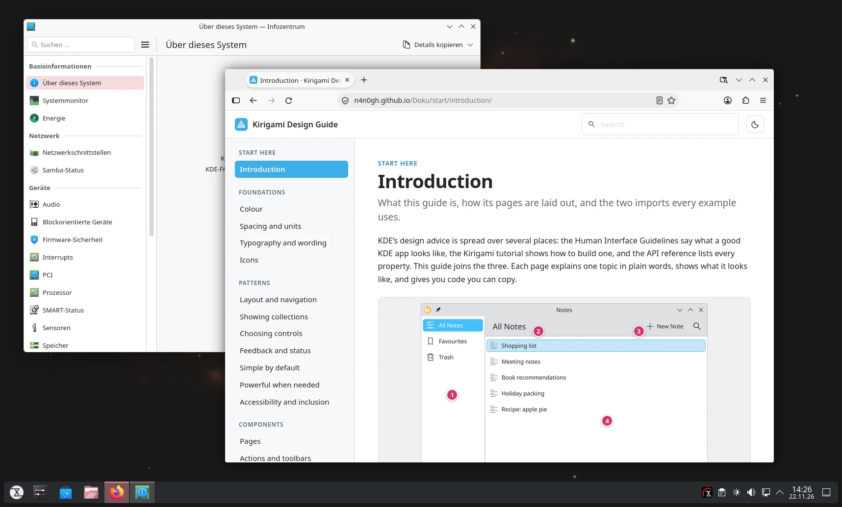
If you want to build good-looking, modern, easy-to-use apps that fit neatly into the KDE desktop, you have to dig through quite a bit of documentation. The Human Interface Guidelines over here, the icon guidelines over there, then the Kirigami tutorial, and the API reference on top of that. Tedious and time-consuming. The Kirigami Design Guide brings all of it together in one place.
The site is split into foundations such as colors, spacing, typography, and icons, into patterns for navigation, lists, feedback, or accessibility, and into ready-made components such as cards, dialogs, and forms. Each topic is explained in plain words, with a picture of what the result looks like and the matching QML code to copy right next to it.
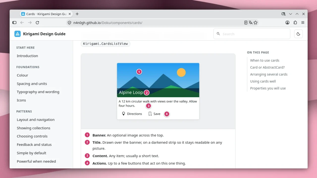
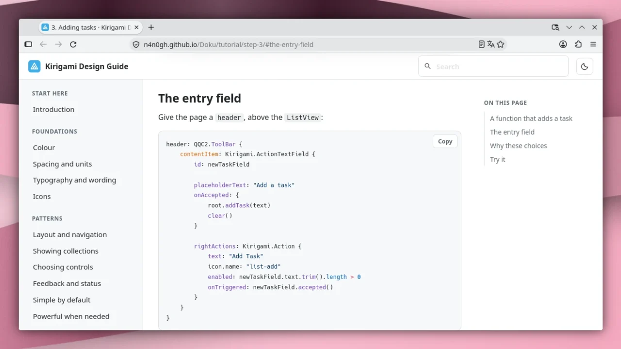
If you would rather learn from an example, work through the tutorial. In seven steps, you build a small to-do app. Each step comes with the code and also with the reasoning behind it, for instance why a button is grayed out instead of hidden. The pictures show Kirigami 6.31 with the Breeze style, so you see what the apps will look like on KDE Plasma.
By the way, none of this is official: the guide is a community project that does not come from KDE e.V. The texts are based on KDE’s Human Interface Guidelines and, like them, are licensed under CC BY-SA 4.0. Anyone working on KDE apps should be happy about it all the same. Vibe coders, too: instead of feeding an LLM half a dozen documents, just hand it this one guide to learn from.


Leave a Reply